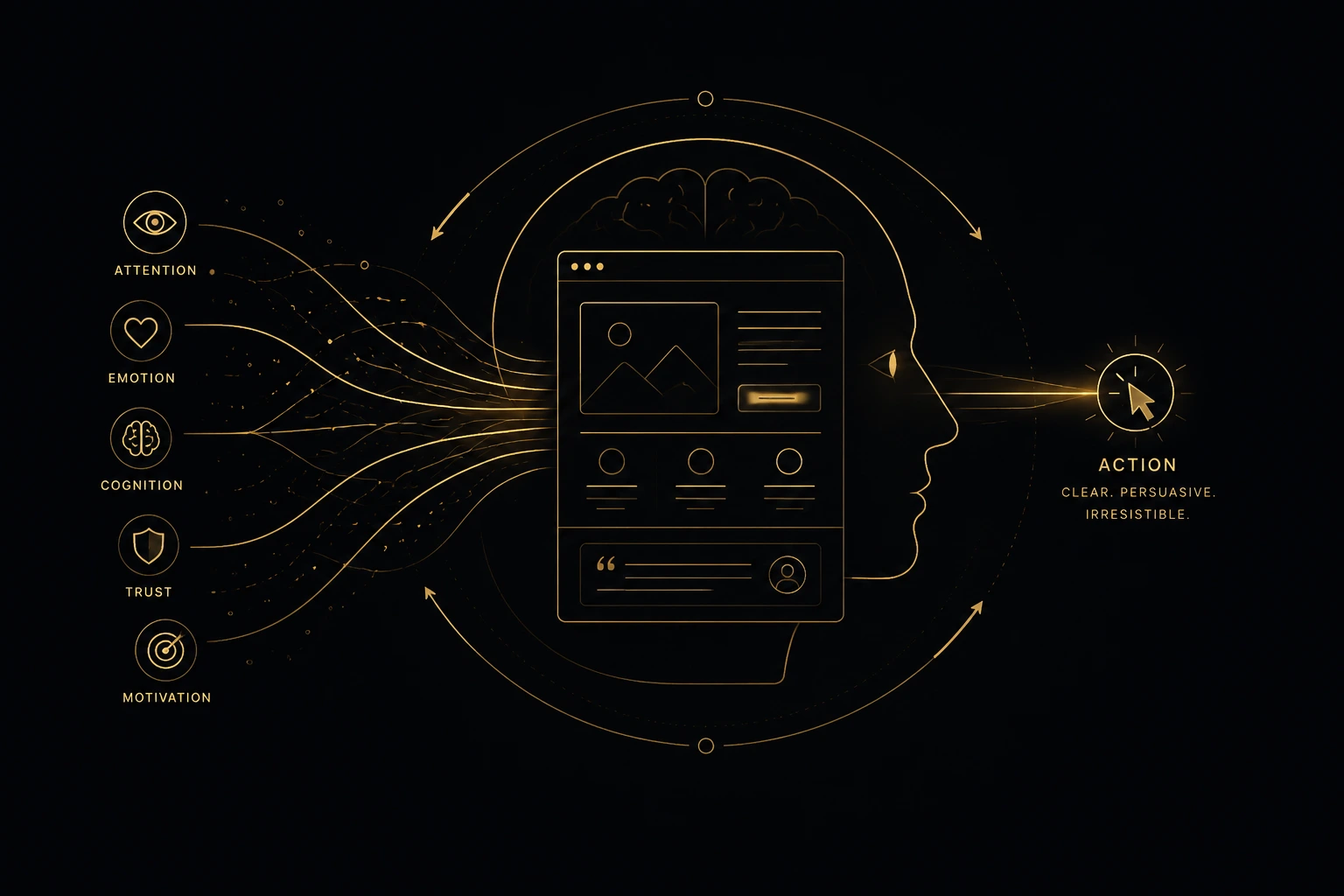
Every day, millions of people visit websites.
They compare products.
Read reviews.
Browse services.
Add items to their shopping cart.
Close the browser.
Leave without buying.
Most businesses assume those visitors made a rational decision.
In reality…
They usually made an emotional one.
That’s one of the biggest misconceptions in digital marketing.
People rarely click because they’re convinced.
They click because something quietly removed their uncertainty.
Something made the next step feel safe.
Something reduced the effort of making a decision.
That’s what high-converting websites actually do.
They don’t manipulate people.
They don’t pressure visitors.
They don’t rely on psychological tricks.
They simply make decisions easier.
Understanding that difference changes the way websites should be designed forever.
People Don’t Click Because They’re Convinced
Businesses often believe websites convert because they contain persuasive copy.
Or stronger calls-to-action.
Or more impressive visuals.
Those things certainly matter.
But they’re rarely the real reason someone decides to act.
Think about your own behaviour.
When was the last time you bought something because a button was larger?
Or because a headline sounded more dramatic?
Probably never.
People act when they feel confident enough to move forward.
Confidence doesn’t appear instantly.
It’s built gradually.
Every answer.
Every interaction.
Every reassuring detail.
Every positive experience quietly reduces uncertainty.
Eventually the next step feels obvious.
That’s when people click.
Not because they were persuaded.
Because hesitation disappeared.
Trust Is Built Before Visitors Read Your Content
Most websites assume trust begins after visitors start reading.
In reality, trust begins within seconds.
Before a single paragraph is finished.
Visitors notice how organised everything feels.
Whether pages respond instantly.
Whether navigation feels intuitive.
Whether the website appears professional.
Whether information feels easy to find.
Those first impressions happen automatically.
People don’t consciously analyse them.
They simply develop a feeling.
Psychologists often describe this as rapid impression formation.
Our brains constantly make fast judgments long before conscious reasoning begins.
That is why first impressions matter so much online.
As we explored in Why Website Speed Matters More Than Ever, performance influences trust before visitors even begin consuming your content.
A fast website feels dependable.
A slow website quietly introduces doubt.
Trust doesn’t start with your sales copy.
It starts with the experience itself.
Every Decision Begins With Uncertainty
Every visitor arrives with unanswered questions.
Can I trust this company?
Is this the right solution?
Will this solve my problem?
Am I making the right decision?
Most websites try to answer these questions eventually.
High-converting websites answer them before uncertainty becomes frustration.
That’s an important distinction.
The goal isn’t convincing people.
The goal is removing reasons not to continue.
Every unanswered question creates hesitation.
Every hesitation interrupts momentum.
Every interruption increases the likelihood that visitors leave.
Great websites don’t force decisions.
They remove obstacles.
As we explained in Why Beautiful Websites Still Fail: The Hidden Power of UX Architecture, every section of a website should answer the visitor’s next question before they need to ask it.
That’s how confidence grows naturally.
Decision Architecture™ Shapes Every User Journey
Every website influences behaviour.
The only question is whether it does so intentionally.
Visitors constantly make small decisions.
Should I continue reading?
Should I trust this information?
Should I compare another company?
Should I contact this business?
These decisions rarely feel significant on their own.
Together they determine whether someone becomes a customer.
At Bureau AETHER, we describe the intentional design of these decision points as Decision Architecture™.
Decision Architecture™ isn’t about manipulation.
It’s about creating clarity.
Reducing unnecessary choices.
Presenting information in the right sequence.
Helping visitors move forward with confidence instead of confusion.
Every headline.
Every testimonial.
Every visual cue.
Every call-to-action.
Together they shape how decisions are experienced.
Not by forcing action.
But by making the next step feel natural.
Digital Friction™ Quietly Destroys Momentum
Most businesses recognise obvious problems.
Broken forms.
Missing images.
Pages that don’t load.
But the biggest conversion killers are often invisible.
A confusing navigation menu.
An unclear headline.
An unnecessary form field.
A delayed page transition.
A button that appears before trust has been established.
Each obstacle seems insignificant.
Together they create resistance.
At Bureau AETHER, we call that resistance Digital Friction™.
Digital Friction™ is the invisible force that interrupts momentum throughout the customer journey.
The harder people need to think…
The less likely they are to act.
Removing Digital Friction™ doesn’t make visitors feel pressured.
It makes progress feel effortless.
That’s one of the most powerful psychological principles in modern web design.
The Science of Cognitive Load
The human brain is remarkably efficient.
It constantly looks for ways to reduce effort.
Every decision requires mental energy.
Every unfamiliar interface demands attention.
Every unnecessary choice increases cognitive load.
Cognitive load refers to the amount of mental effort required to process information.
The more effort a website demands, the more likely visitors are to abandon the journey before reaching their goal.
That’s why simplicity is so powerful.
Not because people dislike information.
But because they appreciate clarity.
Great websites don’t remove information.
They organise it.
Complex ideas become easier to understand.
Important messages become easier to remember.
Decisions become easier to make.
Visitors feel guided rather than overwhelmed.
Reducing cognitive load isn’t about making websites smaller.
It’s about making them easier to think through.
A Real-World Example
Imagine two financial advisory firms.
Both employ experienced consultants.
Both offer similar services.
Both have excellent client reviews.
The first website focuses almost entirely on appearance.
Large hero videos.
Minimal copy.
Abstract headlines.
Creative animations.
Visitors admire the design.
But they struggle to understand what the company actually does.
The second website is equally professional.
However, every page answers a specific question.
Services are explained clearly.
The advisory process is outlined step by step.
Case studies demonstrate real outcomes.
Frequently asked questions remove uncertainty.
Testimonials reinforce credibility.
Calls-to-action appear only after confidence has been established.
The difference isn’t visual quality.
It’s psychological clarity.
One website asks visitors to figure things out.
The other quietly guides them towards a confident decision.
The AETHER Perspective
At Bureau AETHER, we don’t believe high-converting websites persuade people.
We believe they reduce uncertainty.
That’s an important distinction.
Persuasion often focuses on pressure.
Psychology focuses on understanding.
Our approach begins by identifying every question visitors are likely to ask.
Where does hesitation appear?
What information creates confidence?
Which moments increase uncertainty?
How can we remove unnecessary effort?
Only after answering those questions do we begin designing the experience.
Because successful websites aren’t collections of pages.
They’re carefully designed decision journeys.
As we explored in Why Beautiful Websites Still Fail: The Hidden Power of UX Architecture, architecture determines how easily visitors move through a website.
In Why Website Speed Matters More Than Ever, we introduced Digital Friction™ as the invisible resistance that interrupts momentum.
And in What Is Artificial Intelligence Optimization (AIO)?, we explained why websites increasingly need semantic structure that both people and AI can understand.
Together, these ideas form the foundation of Decision Architecture™.
When psychology, structure and technology work together, decisions become easier.
Not because visitors are manipulated.
Because they’re supported.
Conclusion & Final Thought
People don’t buy because websites are louder.
They don’t click because buttons are bigger.
They don’t convert because headlines are more persuasive.
They act when uncertainty disappears.
Every successful website is built on dozens of small moments.
A fast-loading page.
A reassuring testimonial.
A clear explanation.
An intuitive navigation menu.
A logical next step.
Individually, these moments seem insignificant.
Together, they create confidence.
And confidence is what ultimately drives every meaningful decision.
The highest-converting websites don’t convince people to act.
They make acting feel like the most natural decision in the world.
If you’re ready to build a website designed around human behaviour instead of assumptions, explore our Custom Website Development services or discover how our SEO & AIO strategy combines psychology, UX Architecture™ and semantic strategy to create digital experiences that earn trust before asking for action.